What I learned from Big Sur’s redesigned Wi-Fi menu
Because I’m a massive nerd 🤓, I’m deep-diving into the design of macOS Big Sur’s Wi-Fi menu.
I know. Weird. But there’s plenty to talk about!
This case study is inspired by About Face: The Essentials of Interaction Design. 🙌🏻
Part 1: The icon
My goal for this case study is to solidify my learning and to connect with other design folks. Say hi! 💬
I think my opinions have merit but they aren't steadfast. I don’t have insight into Apple’s research nor a tonne of design experience. Let’s have an idea smackdown.
The first and founding layer of design is intention. What problem are we solving and why?
We need to have a good answer to this question before we can make any judgements about an existing design, or start a new one. The answer defines our design values. 🎯
The intention question is, IMO, the most interesting as it’s the frame for innovation. ✨ But we could get lost down a rabbit hole 🐇 pretty easily. Let’s make an assumption to ground our discussion.
Let’s assume the Catalina version of the menu does a good job of achieving its functional responsibilities.
This way, we can comment on the design’s iteration over more existential questions (😅).
So, with that, let's take a look! 🚀
Because people only need to change their wireless connection settings when something is wrong or they’re away from their usual networks, we can safely say that this menu is used fairly infrequently. (Hopefully you don’t have too many connection issues. 😬)
Its occasional use gives it the status of a daemon app (👹?), which means it sits quietly in the background doing its thing with minimal interaction required.
Daemon apps need to be clear and simple as infrequent use means people don’t remember what they did last time.
The Wi-Fi icon lives permanently in macOS’s menu bar by default. Without opening the menu, I can see at a glance what my MacBook’s connection status is.
Apart from its visual appearance, which I’ll touch on soon, there’s no change from Catalina.

The icon is a rich, visual, modeless feedback (RVMF) technique. It’s dynamic which makes it rich in feedback. Icons are visual, obvs. 😉 And it’s modeless as users don’t need to switch away from their current task to understand their connection status.
RVMF evolved from the idea that well-behaving digital products should volunteer information without interrupting the user’s flow.
By having the network status persistently shown but neatly tucked away, users can choose when they act on information. 🙋🏽♀️
A con of RVMF is that it often depends on idiomatic (meaning learned) contextual numbers, symbols, icons, and colour coding. While you and I are experts (I’m sure 😁), part of Apple’s brand promise is that of simplicity and ease of use for newbies.
Although we’ve had an opportunity to learn what the icon and its variants mean, there may be some people who haven’t. This is where a tooltip, presented when the cursor hovers, would be useful. Tooltips are a great way to teach rich, visual, modeless feedback.
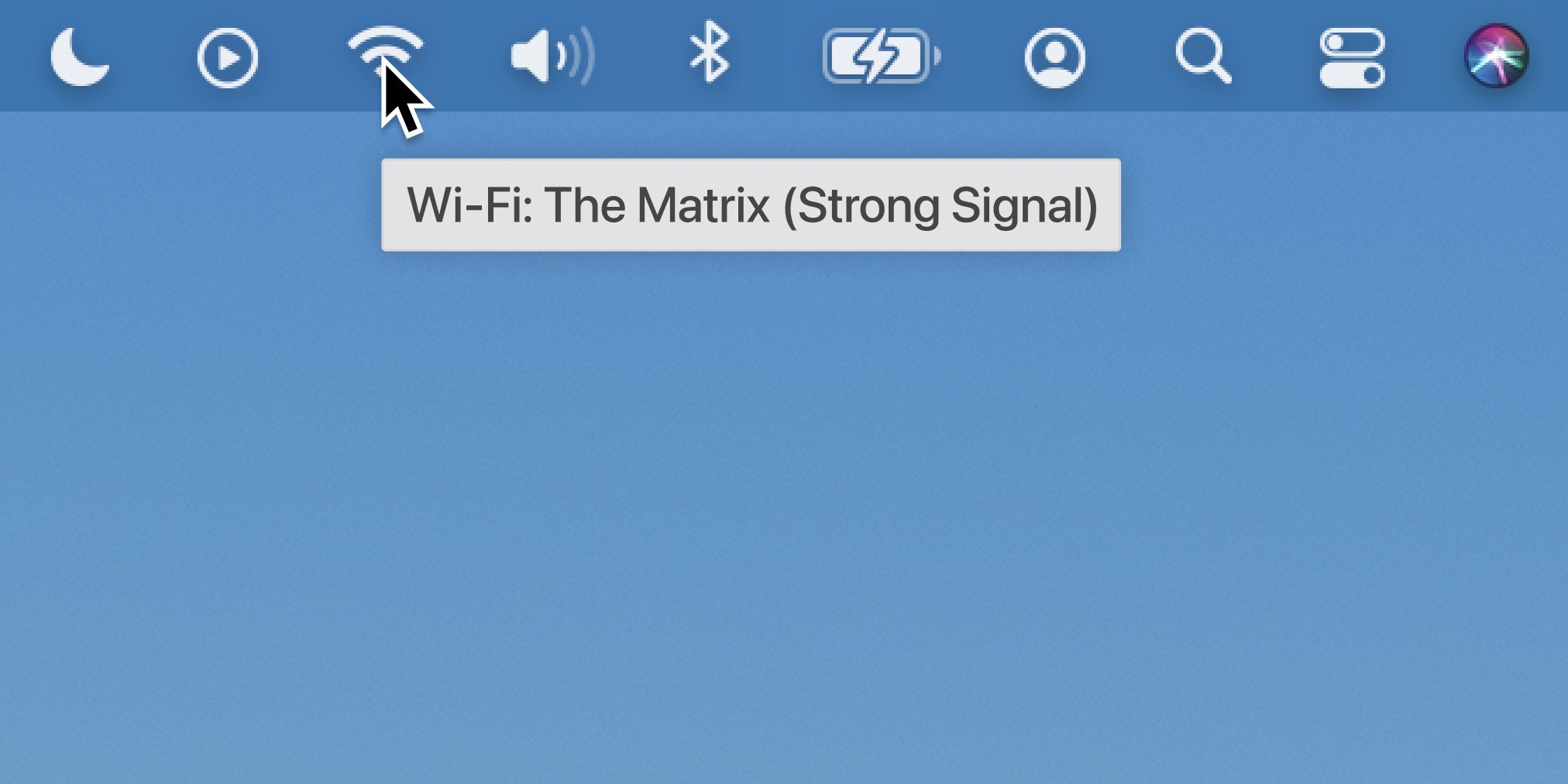
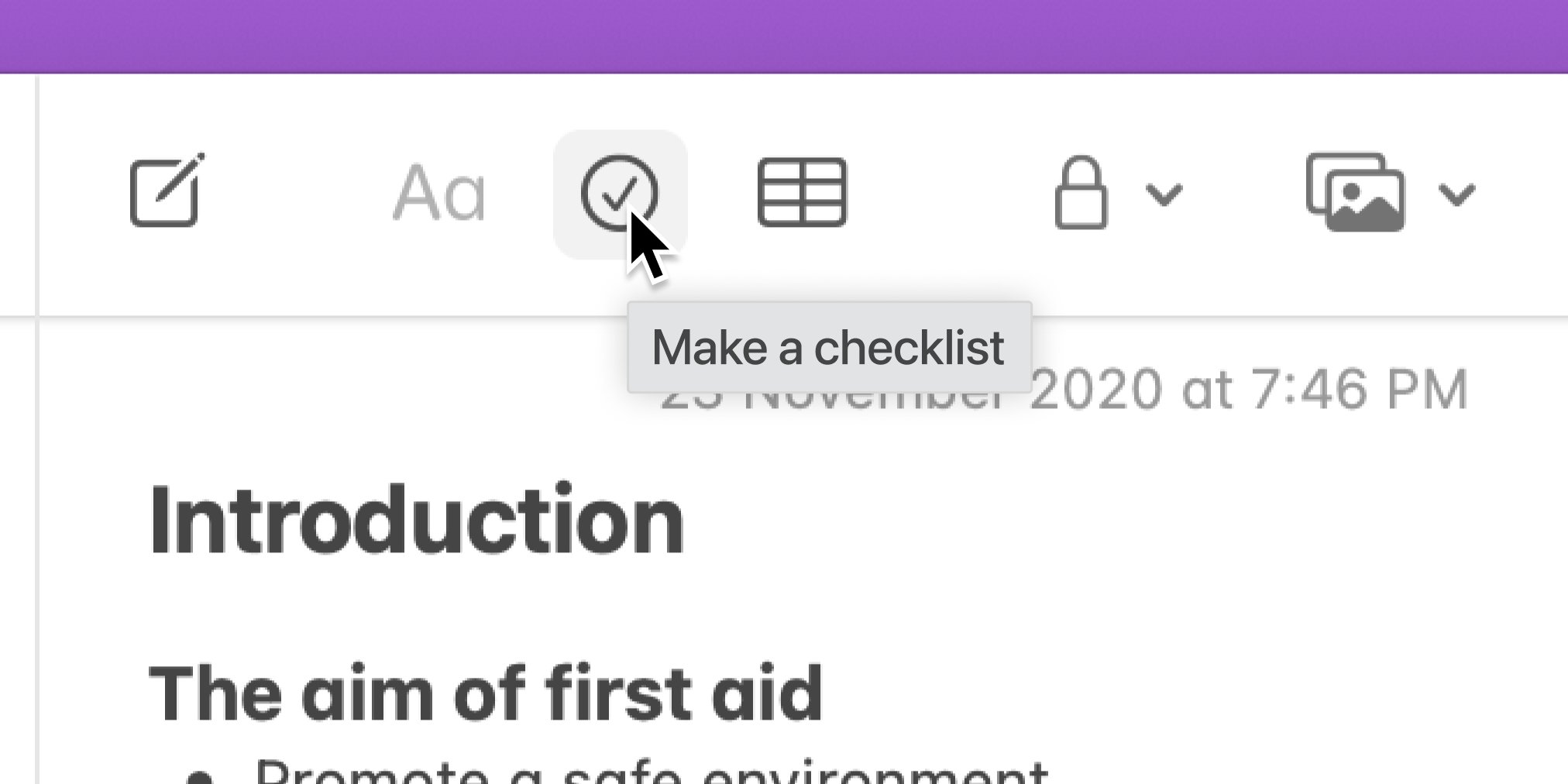
It’s surprising that the menu bar icons don’t already offer tooltips, considering other apps, like Notes, generously show helpful tooltips for toolbar buttons.
Working in a design system team, I know how important it is that design elements fit within a cohesive system.
Ideally, UI elements should look and work the same way to make learning and using macOS as easy as possible. The mismatching tooltip behaviour between toolbar buttons and menu bar icons highlights the need for a more cohesive approach to learnability.
Clicking the icon opens the menu. The UI here, too, could be improved as the icon doesn’t give any clues about its receptivity to being clicked—but that’s a tangent I’ll leave for later.
Part 2: The menu
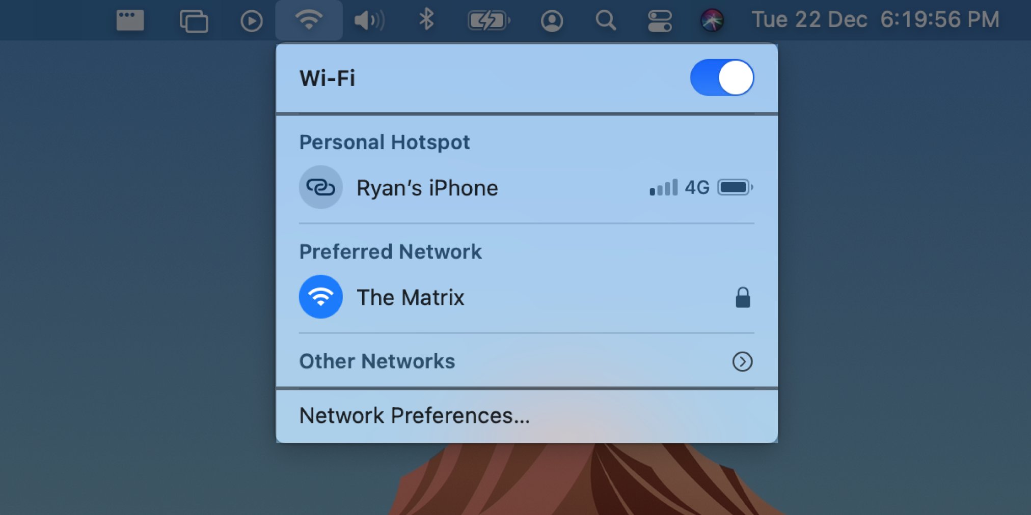
The menu itself has changed quite a bit from macOS Catalina.
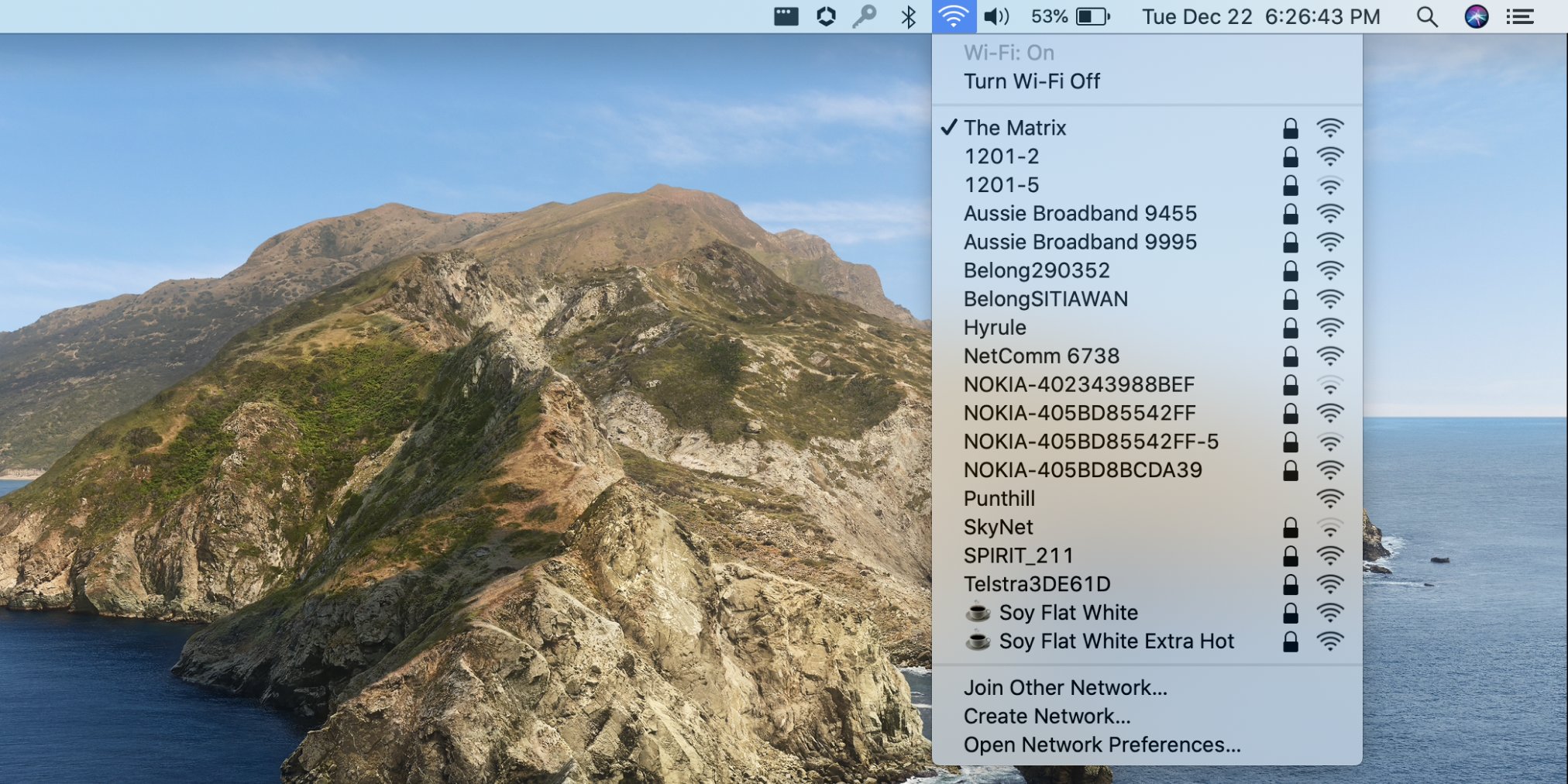
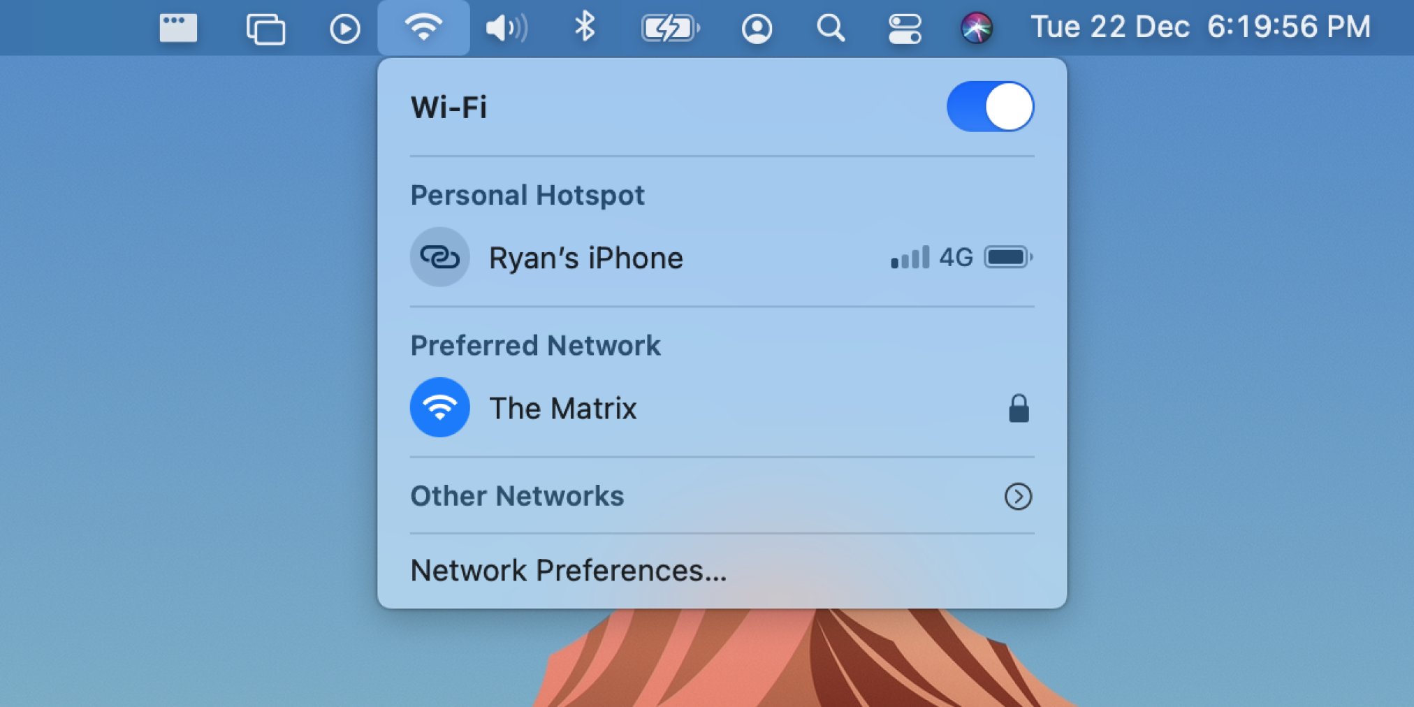
It’s also worth noting what's stayed the same. Both menus are divided into sections: Wi-Fi control, available networks, and advanced preferences. From the order, it would be fair to assume that people most frequently open the menu to turn Wi-Fi on or off, as it comes first.
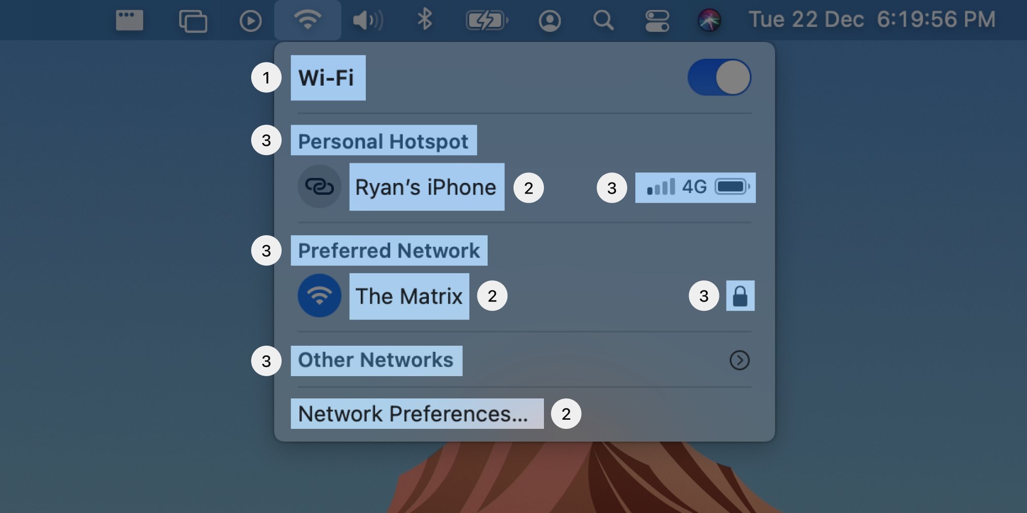
Let’s look at the menu through a visual design lens. The dividing lines, along with the comparatively small section labels, and bolded title promote a visual hierarchy, a guide to our eyes as to what’s important and how elements are grouped together.
Smaller elements are less important than larger ones. In this case, the labels of menu controls themselves are more important to users over the helpful but secondary section labels. The icons and section labels are shown in a matching grey to reinforce their secondary nature.
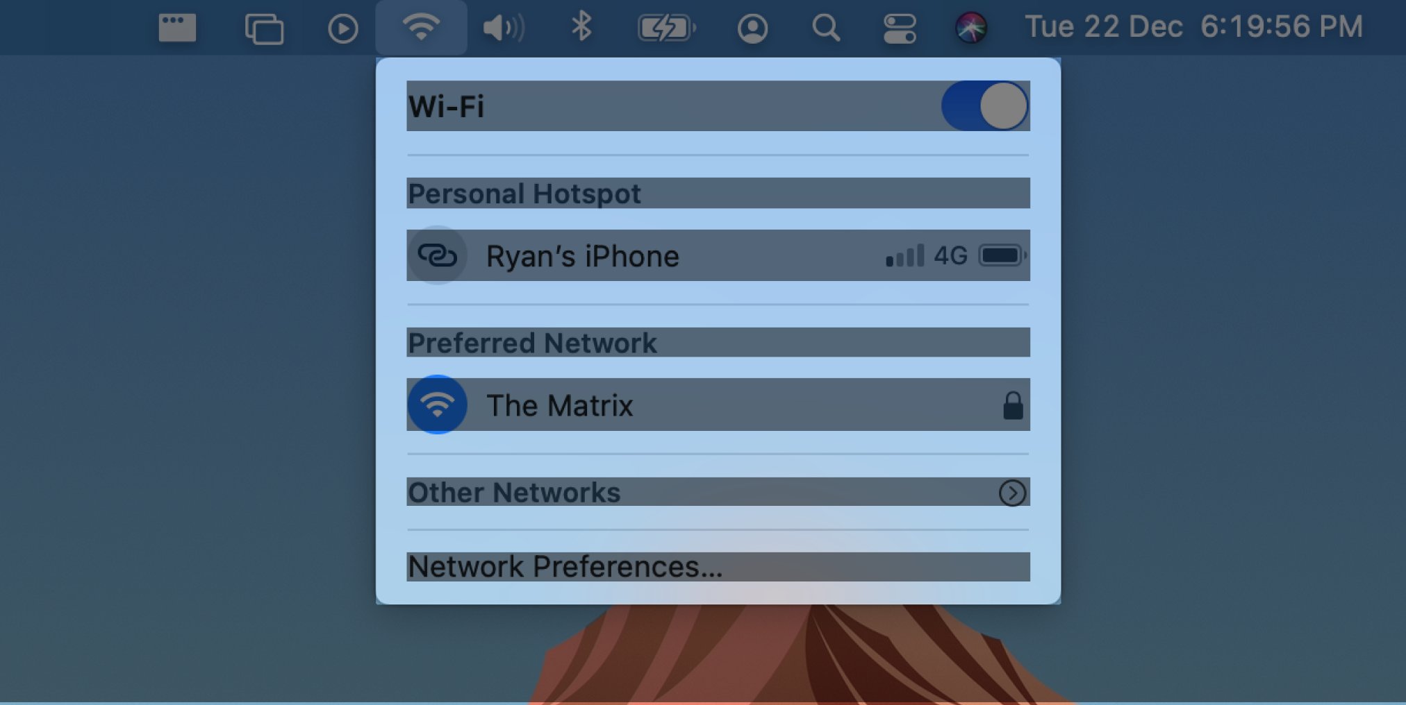
Other changes to the visual design help reinforce Apple’s brand of simple-but-powerful. Menu elements have been given space to breathe with the addition of negative space in the margins of the menu and in padding between menu items, making the UI feel more relaxed.
The menu’s rounded corners match the new aesthetic across both software and hardware for all of Apple’s new OSes and devices. Even the icons have been adjusted to have a softer, simplified look.
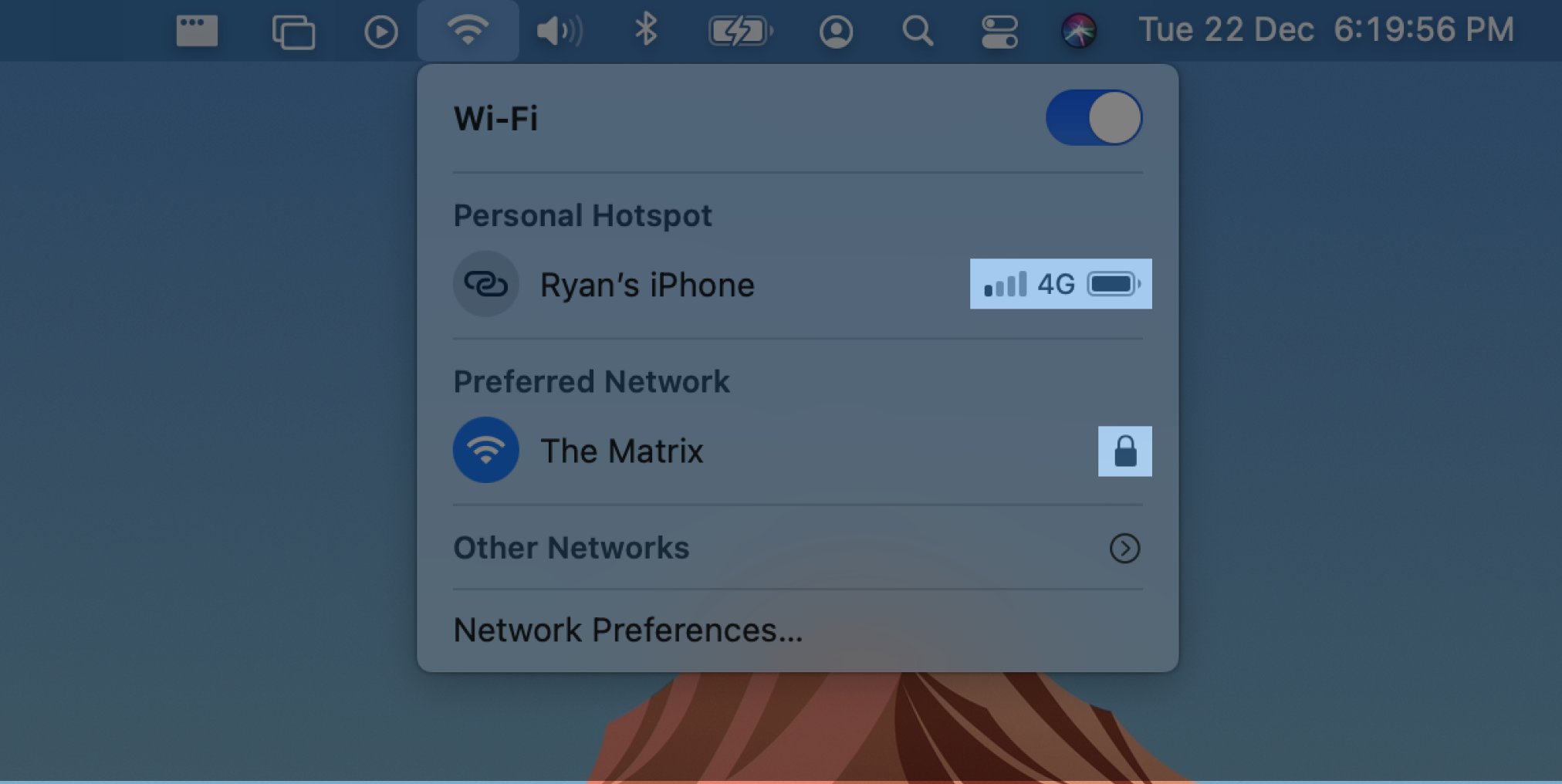
Both menus make excellent continued use of rich, visual, modeless feedback. Without having to open a dialog or any additional menus, the Wi-Fi menu offers information about network security and signal strength. It even shows my iPhone’s signal strength and battery charge! 👌🏻
Part 3: Skeuomorphism
The switch is an example of skeuomorphic design, which means it’s based on a real-world representation. In this case, a digital switch works in the exact same way as a real-life, physical switch in that sliding the knob from one side to the other toggles something on or off.
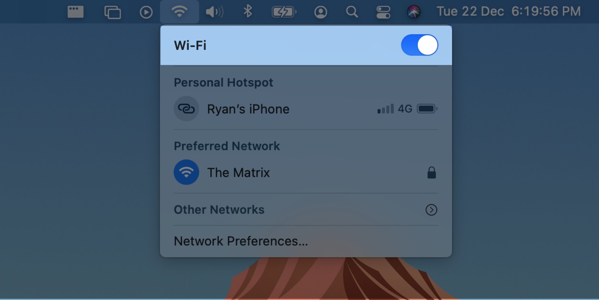
Because people use switches a lot IRL, it’s not a huge ask for macOS users to understand how digital switches work. However, thereʼs a threat to this understanding: flat design. Flat design is a style of UI design which doesn’t include three-dimensional cues, like shadows.
Although we don’t want our interfaces to look like a sculpture garden (unless your brand is all about the building blocks of language and you’re Duolingo; they love it 😆), some indication of depth creates an affordance, or a clue about how something should be used.

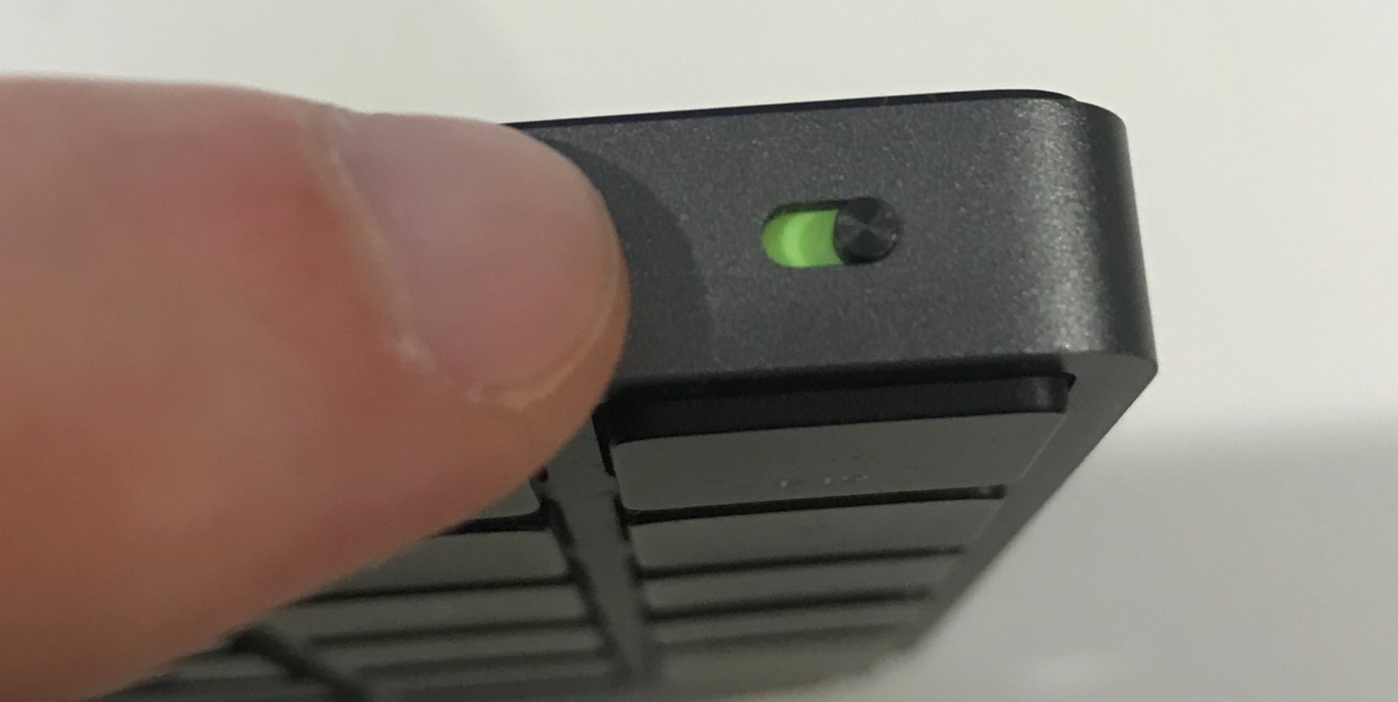
Notice that with the real-life Magic Keyboard switch, the knob is raised slightly from the surface, and we can clearly see that it sits in a track, because of the shadows cast by its components. We intuitively know that knobs can slide along tracks.
Although Apple’s digital switch is now largely flat, it retains some (very) subtle shadows.
The whole point of a skeuomorphic design is to enable us to leverage our users’ knowledge of the real world. Within reason. 😬
All-out skeuomorphic attempts, like early versions of the Calendar app which appeared as a literal wall calendar, are easy for newbies to understand. But, they become a burden when users learn the UI because they ignore the benefits of a digital platform. 🙈
A digital calendar that doesn’t scroll between months, because its real-life counterpart can’t, is kinda missing the point. Thankfully, the macOS Calendar has always allowed scrolling.

Metaphoric design is now overlooked in favour of idiomatic design because it caters to the majority of users: perpetual intermediates.
An example of an actual metaphor is the desktop/files/folders 🗂 UI still around today.
New users don’t want to be new. They just want to learn how to get good enough. Most users will stay intermediates, although a few will become experts. Some experts may stop using your app for a while, but then when they come back... yep, they’ll be intermediates again. ☯️
Designing for intermediates is where we should be putting most of our effort. That’s why subtle visual affordances as part of small sprinklings of skeuomorphic design strike the right balance between real-world recognition and digital appropriateness.
Part 4: Interaction design
The most benefit Apple gains from using a switch here, as far as I can tell, is that it begins to unite the interaction models of its two most popular product categories. iPhone users are now used to seeing on/off commands being represented as switches.
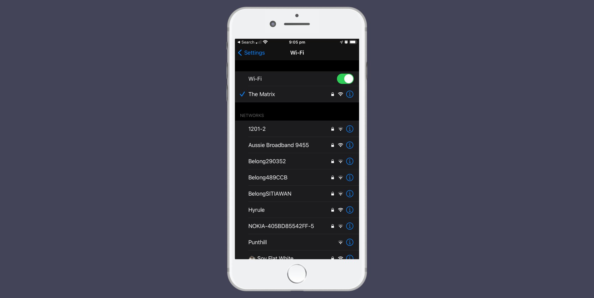
It seems to be part of Apple’s strategy to bring together the traditional touch-only UIs of the iPhone and iPad with the trackpad-only MacBook, especially since the introduction of the iPadOS’s cursor.
Because the MacBook isn’t (yet) touch-enabled, this design choice does present an issue: it makes toggling Wi-Fi on or off harder. Why? Because the interactive area of the control has changed size and shifted position.
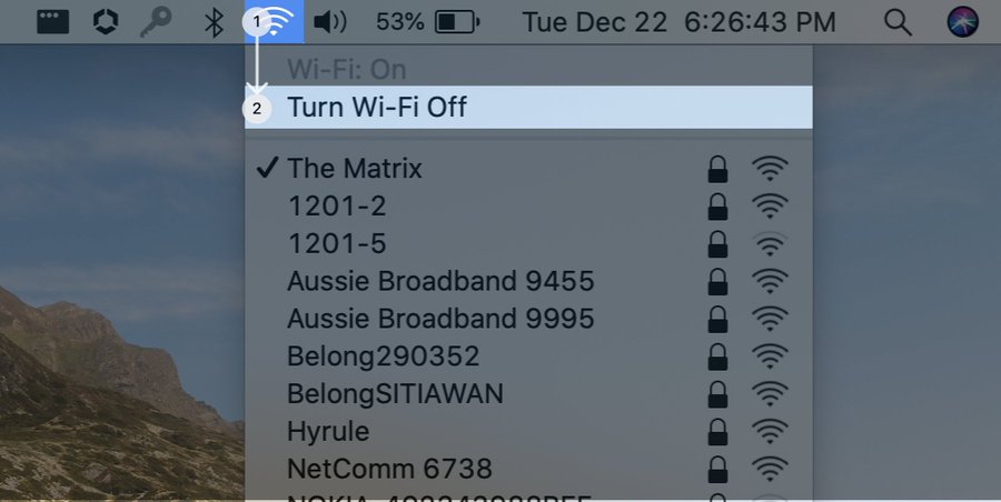
In the old menu, you could click anywhere on the “Turn Wi-Fi On/Off” command menu item. It extended underneath the space occupied by the menu’s icon. This meant you could click the icon and then move the cursor straight down to the menu item and click for a second time.
Because this is a largely up-and-down movement, it doesn’t require much dexterity from your hand or finger on a mouse or trackpad. We can use course motor movements from our arms or hands to reach and activate the toggle easily.
he new menu’s switch can only be toggled by clicking the switch itself. The interactive area has shrunk by so much that we now need to use fine motor movements to move the cursor sideways, as well as down from the icon, to find the target.
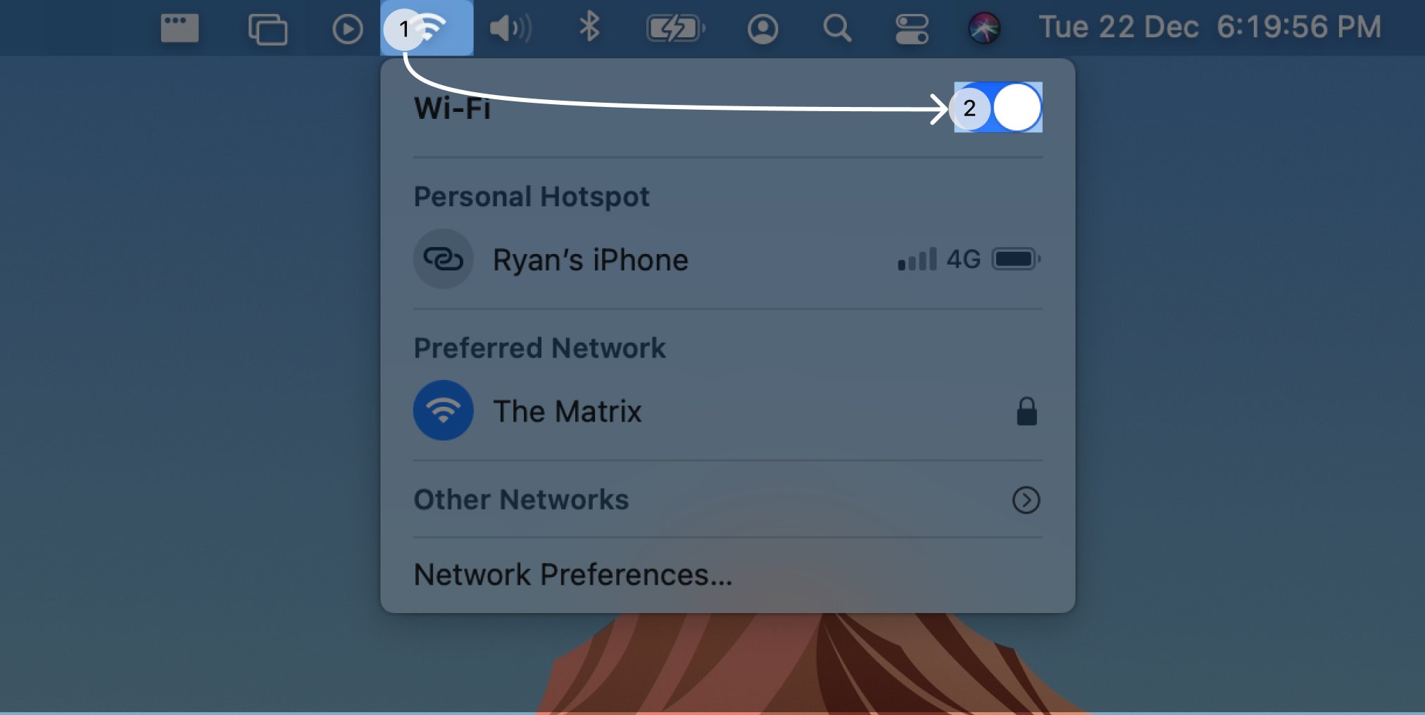
This is much harder and takes longer than if we could just click the switch’s label. Clicking a control’s label to activate it is actually already a solidified pattern on the web because it is widely accepted as a usability benefit.
It’s also puzzling we can’t just click the label, because if you click and hold your cursor on the Wi-Fi icon, and then drag your mouse to the switch’s label, the switch and its label are highlighted! When you let go, the switch toggles and the menu disappears.

Both the click-and-click and click-and-drag interactions for the menu bar were working harmoniously for many versions of macOS. It’s an admirable way of neatly supporting a divided user base in which there is a split preference. Clicking the label should toggle the switch.
Also, a switch is different from a menu command item in that the switch remains visible when you toggle it. Compare this behaviour with the previous one, in which clicking the command menu item issued the command to toggle Wi-Fi on or off and then dismissed the menu.

Currently, the switchʼs label isnʼt interactive, but I have to click it before I realise that. 😞 The lacking clues about interactivity seem to be a problem on most desktop environments and are in stark contrast to how the web works.
Most web UIs use hover, focus, and press states to indicate pliancy. Pliancy shows an element’s readiness to accept interaction. Obviously, providing visual affordances like shadows or handles hint at pliancy, but dynamic affordances to indicate pliancy is important, too.
Dynamic pliancy is achieved using a couple of techniques. The first is to visually change an element when a cursor or finger interacts with it.
GitHub’s buttons darken and raise up slightly when hovered over.
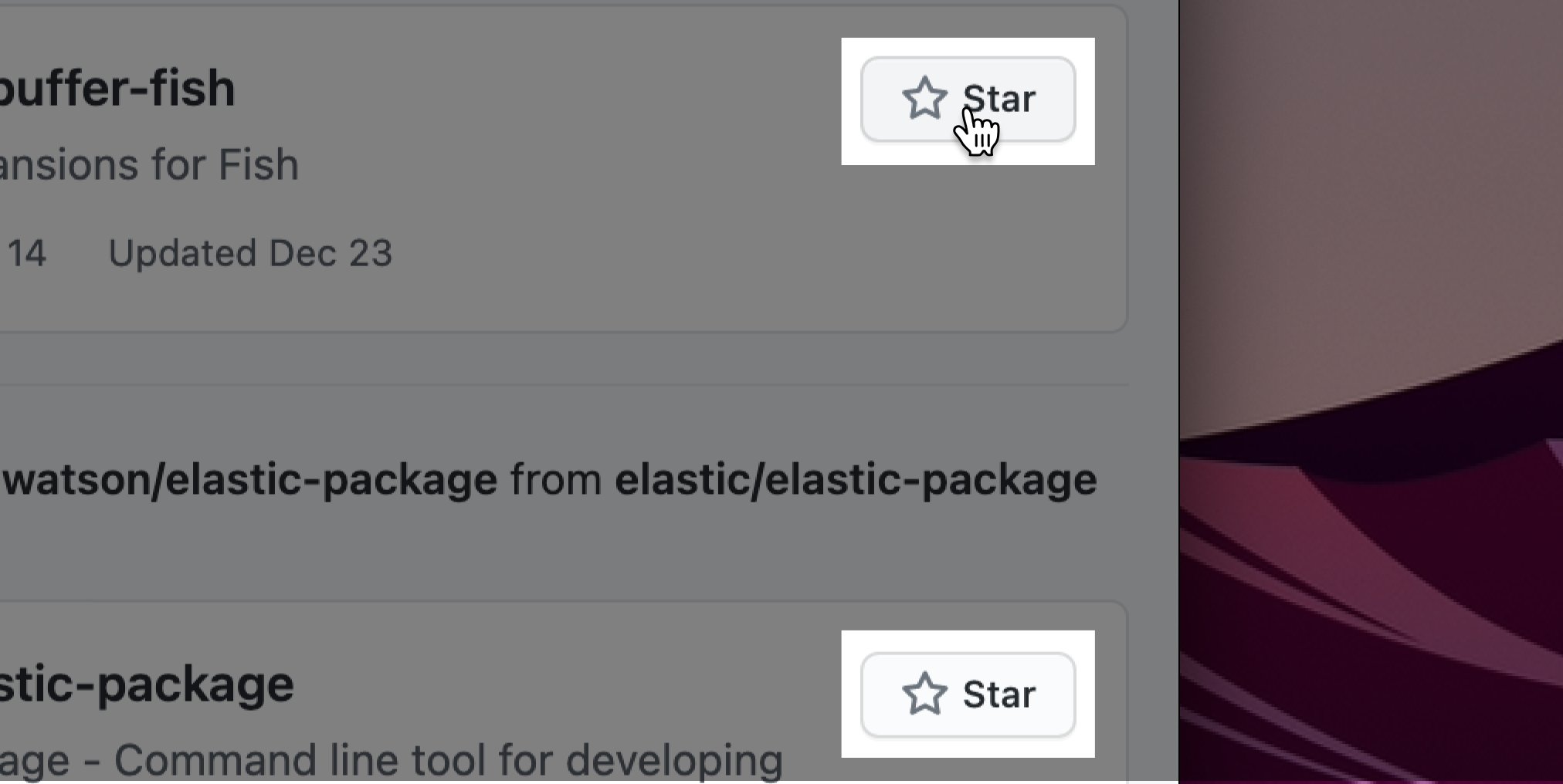
The second is to use cursor hinting, which is to change the appearance of the cursor to hint at what will happen when the user clicks.
macOS’s cursor changes to a resize handle if it’s hovered over the edge of a resizable window.

When the web was in its infancy, cursor hinting was used to indicate when the user’s cursor hovered over a link. These days, most interactive elements on the web indicate pliancy using cursor hinting and dynamic changes in visual affordances.
Interactive elements which don’t respond to the cursor feel broken ⚡️, like a button that refuses to change its appearance to acknowledge a hover or a press. Likewise, it’s hard to tell something isn't interactive when the usual dynamic pliancy cues are lacking everywhere.
Looking at how these patterns are replicated across macOS it becomes clear that a lack of pliancy is a problem for many parts of the system and not just this menu, which means any change would need to be considered holistically.
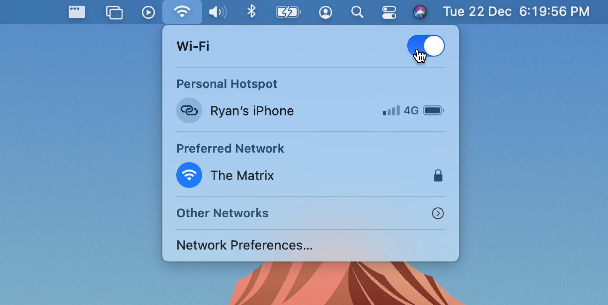
But, it’s my opinion that the cursor should hint at this control’s pliancy by changing to a pointed hand as it does on the web. The switch could even suggest it is about to be toggled on hover, and show a darkened state on the press or touch event.
Letʼs talk about why designing for cancellable interactions is important, and how the menuʼs switch breaks the rules.
What do we mean by cancellable interactions? Well, have you ever filled out a form, for example, and realised that youʼve made a typo as youʼre pressing down on the Do The Important Thing button?
Did you have a brief moment of panic 🙀 and then give in? Or did you work out how to change your mind?
Most UIs allow users to cancel a button press. During a click or touch, you can slide the cursor or your finger away from the control to cancel the action.

A well-designed button uses a change in its visual state to communicate that itʼs currently being pressed. This helps us understand it will activate when the mouse button or touch is released. Pressed means “about to activate”.
A button from which weʼve shifted our cursor or finger visually pops back up (if itʼs not flat) or otherwise changes its visual state back to its original presentation. Unpressed means “you have to press me first”. Cancelled!
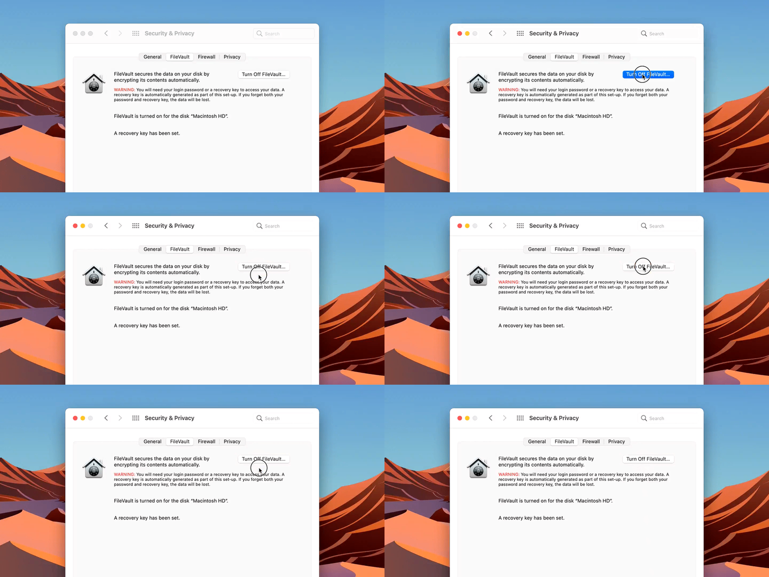
Unfortunately, the macOS switch violates this principle in that if I click and hold the switch and then drag my cursor left and right, it slides the knob and triggers the toggle even if the cursor is no longer positioned near the switch.

A switchʼs state is obviously easily reversible. But it is worth acknowledging that macOSʼs switches currently go against the principle of cancellable interactions.
Good designers always think of systemic effects. What if this switch controlled something else?
Real-life consequences of accidentally flipping a switch arenʼt as reversible.
What if this switch unmuted my computerʼs sound in a quiet lecture hall? Turned off Do Not Disturb during an important presentation? Unblocked messages from a toxic someone?
We should always have the option of changing our minds. Good UIs donʼt punish us for being human.
macOSʼs switches should allow us to change our mind and cancel the toggle by sliding the cursor away from the control.
Let’s talk about how the Wi-Fi menu has been de-cluttered since its previous incarnation.
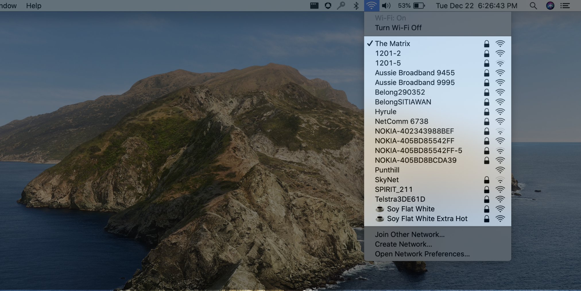
The next menu section is dedicated to showing which network we’re connected to and which networks are options for connection. The Wi-Fi menu from macOS Catalina overwhelmingly showed all of the available options, even if I was already connected to my preferred network.
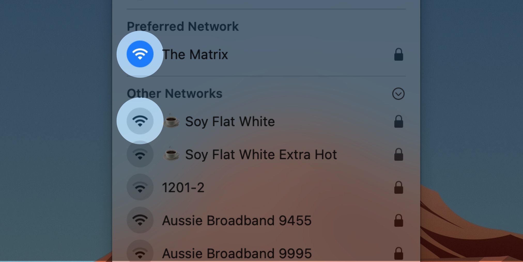
Big Sur’s menu is designed to progressively disclose complexity by separating out newly discovered networks from the user’s preferred networks and placing them inside a collapsable section. This way, I only have to scan the list of available networks when I’m away from home.
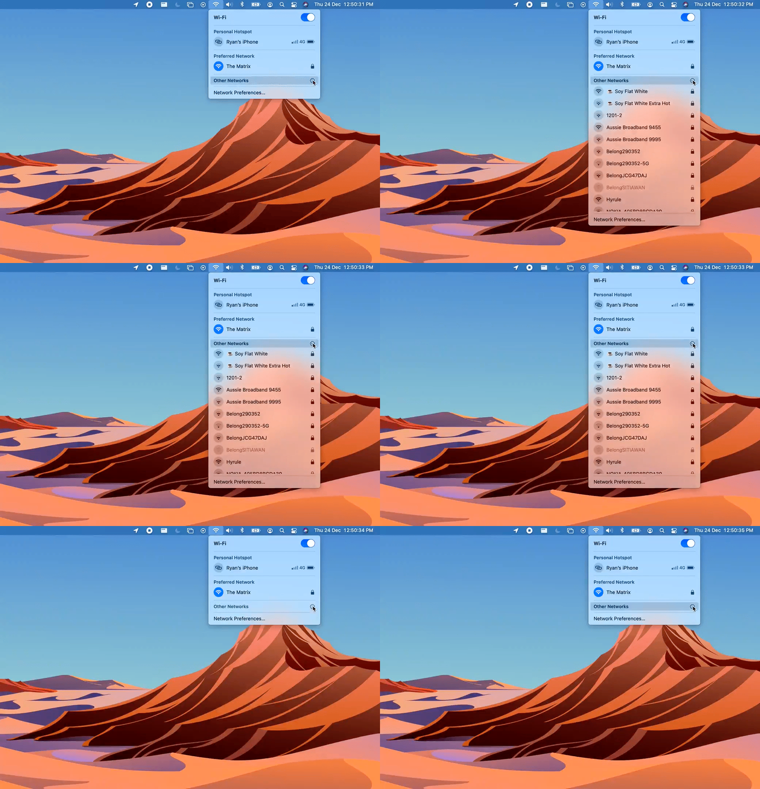
The eagerness of the menu to pop open is evident from the overshoot and following bounce of the expansion animation. This gives the impression that the UI is meant to feel energetic and responsive. There is no motion when collapsing the section, though, which seems weird. 🤔
The use of the outlined expansion icon here is visually inconsistent with other uses of collapsable sections throughout macOS and gave me pause. Using a regular sideways arrow here matches the other collapsible controls in the OS but clashes with its use to indicate sub-menus.
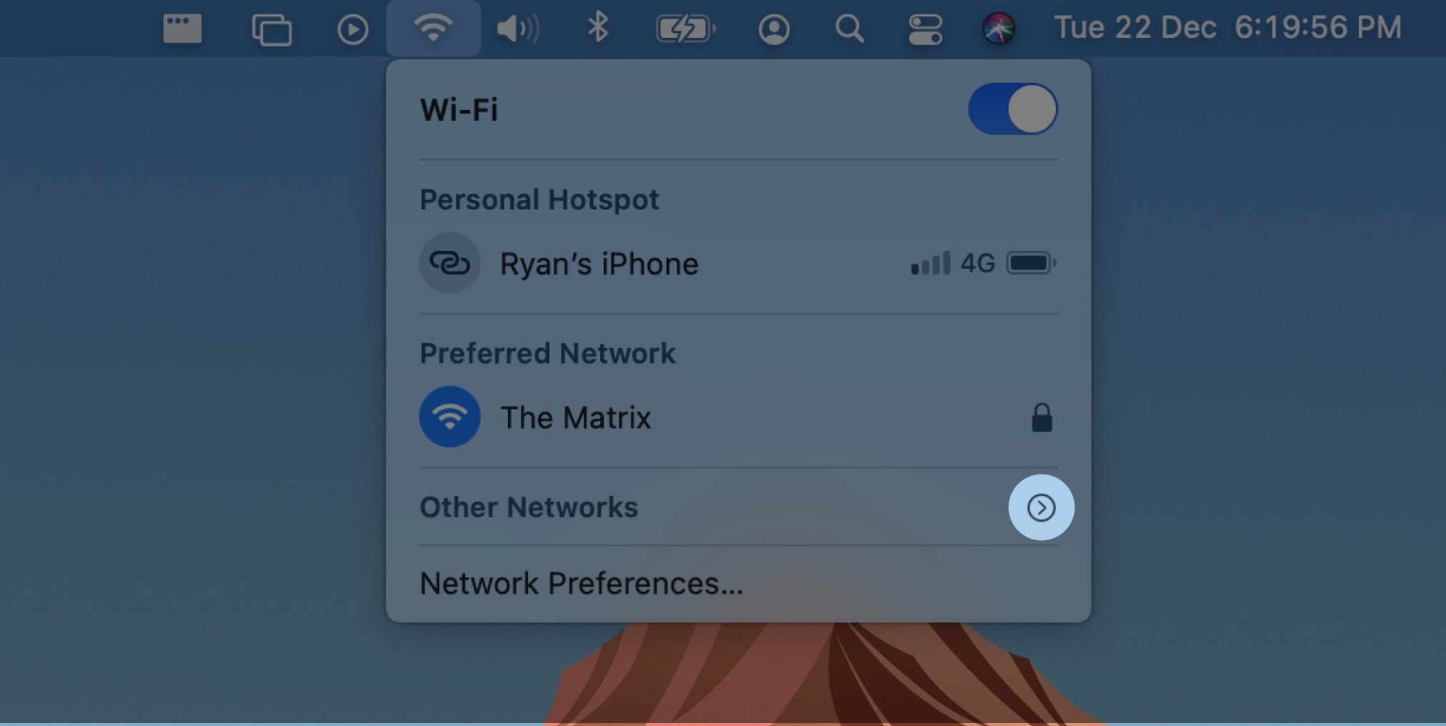
I think the best solution here would have been to replace the regular collapsable control throughout the OS with the circular version to make it distinctive.
Managing coherence is a difficult job, but users get frustrated when they have to relearn slightly different concepts.
Network selection is also necessarily modelled on a radio group as only one network can be connected at a time. The old design uses a checkmark to show which network is connected but didn’t hint at its mutual exclusivity.
The upside to the new presentation of this section is that the round toggle icons resemble radio controls. They also closely match the idiom in use in iOS’s control centre, further strengthening the coherence between the two operating systems.
